Who would’ve thought disappearing photos could spark a social media revolution—and build a multi-billion dollar brand in the process?
That’s exactly what Snapchat pulled off.
In 2011, it started as Picaboo, a scrappy idea from two Stanford students. By 2014, it was handling 700 million snaps a day, pioneering Stories, and becoming the go-to app for Gen Z. But when Snapchat released its pitch deck that year, it wasn’t asking for funding—it was teaching brands how to speak a whole new visual language.
And it worked. Not long after, Snapchat raised $50 million and cemented its place as one of the most influential social platforms ever.
Today, I’m breaking down Snapchat’s pitch deck—slide by slide. We’ll uncover what it got right, what you can learn from it, and how you can apply those lessons to craft a pitch deck that actually connects.
Let’s start with a quick overview of Snapchat slides.
About Snapchat (then vs. now)
In 2011, Snapchat didn’t start with the name we know today—it was originally launched as Picaboo, built by three Stanford students: Evan Spiegel and Bobby Murphy.
Their idea was simple but bold: An app where photos disappear after being viewed. No timelines, no profiles—just quick, pressure-free sharing. That single feature struck a nerve with users tired of permanent posts.
After rebranding to Snapchat, usage exploded—especially among teens who didn’t want every photo to live online forever.
Fast forward to today, Snapchat features include Stories, Discover, AR Lenses, and Spotlight. It has evolved into a comprehensive platform for communication, entertainment, and content discovery.
Currently, Snapchat is a global platform with over 460 million daily active users, earning 1.36 billion U.S. dollars in revenue. The product may have evolved, but the core idea—ephemeral, authentic communication—is still what makes it stand out.
Detailed Snapchat pitch deck analysis (slide-by-slide)
Right from the start, Snapchat makes a smart tactical move: The entire deck is designed vertically, just like the app itself. You scroll through it like you would a Story on your phone. It’s a subtle but sharp reminder that this is a mobile-first product built for mobile-first users.
Snap was never about fitting in, so the unconventional approach makes sense. It probably triggered stronger first impressions. So, whether people loved it or questioned it—they definitely remembered it.
That said, let’s walk you through what each slide covers, what stands out, what could’ve been better, and what you can take away from them.
Let’s dive in.
Slide 1: Title (Cover) – “For Business”
Right from the first slide, Snapchat does something bold—it doesn’t even say “Snapchat.”
Just a bright yellow background, their ghost logo, and the title: “For Business.” No tagline. No intro. Just straight into it.
At first glance, I liked the confidence. It feels intentional—like they knew their brand was strong enough to speak for itself. And to be fair, for most people seeing this deck at the time, it probably was.
What works here is the clarity of intent. This isn’t a general startup pitch—it’s a message to advertisers. The tone says: We’re here to talk business.
Would I have added the company name? Probably. But I get the choice.
Takeaway: Your title slide sets the tone. Keep it simple, but convey who you’re and why they should continue watching. Confidence is great—just don’t leave clarity behind.
Slide 2: Get to Know Us (Company History & Stats)
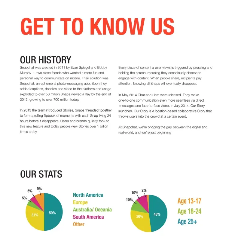
This slide gives a quick overview of Snapchat’s early story and user base. It covers when the app started, who built it, how fast it grew, and who was using it by 2014.
What I like here is the focus on real usage. Instead of discussing ideas or potential, they demonstrate actual behavior: How people were using the app and how quickly it was gaining traction.
The two pie charts help too, showing age breakdown and a strong user base in North America and Europe.
However, if there’s one thing I’d change, it’s the format. There’s a lot of text—paragraphs stacked together. It works if someone’s really reading, but investors often skim. This much text risks losing them before they catch the good stuff.
Takeaway: Use your early slides to show traction and user behavior. Real usage speaks louder than plans.
Slide 3: Philosophy (Ephemeral focus)
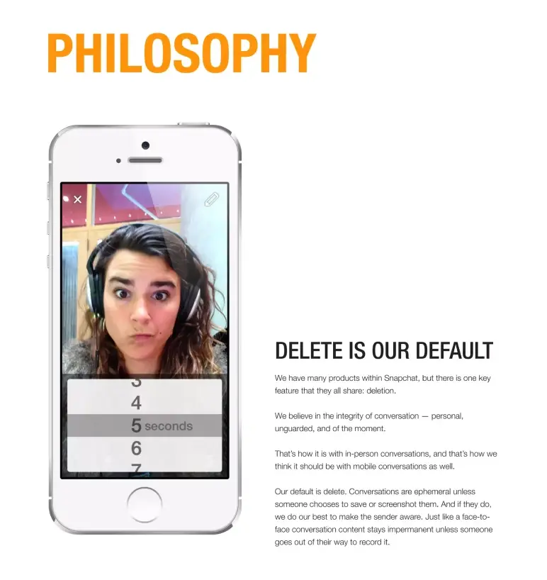
This slide zooms in on what Snapchat stands for: “Delete is our default.”
Right away, it tells me Snapchat isn’t trying to be a photo album or a public feed. It’s made for personal, in-the-moment sharing. No pressure to be perfect, no permanent record.
It’s a direct answer to, “Why are you different from Facebook or Instagram?” And honestly, this one line—“ephemeral by design” (Intentionally built so the content doesn’t last forever)—sets them apart more than any stat could.
My only note? The same idea came up in the previous slide, so this could’ve been combined or delivered with more punch.
Takeaway: If your startup has a core belief, make it loud and clear early in your deck. Don’t say the same thing twice—say it once, say it well, and move forward.
Slide 4: Product overview
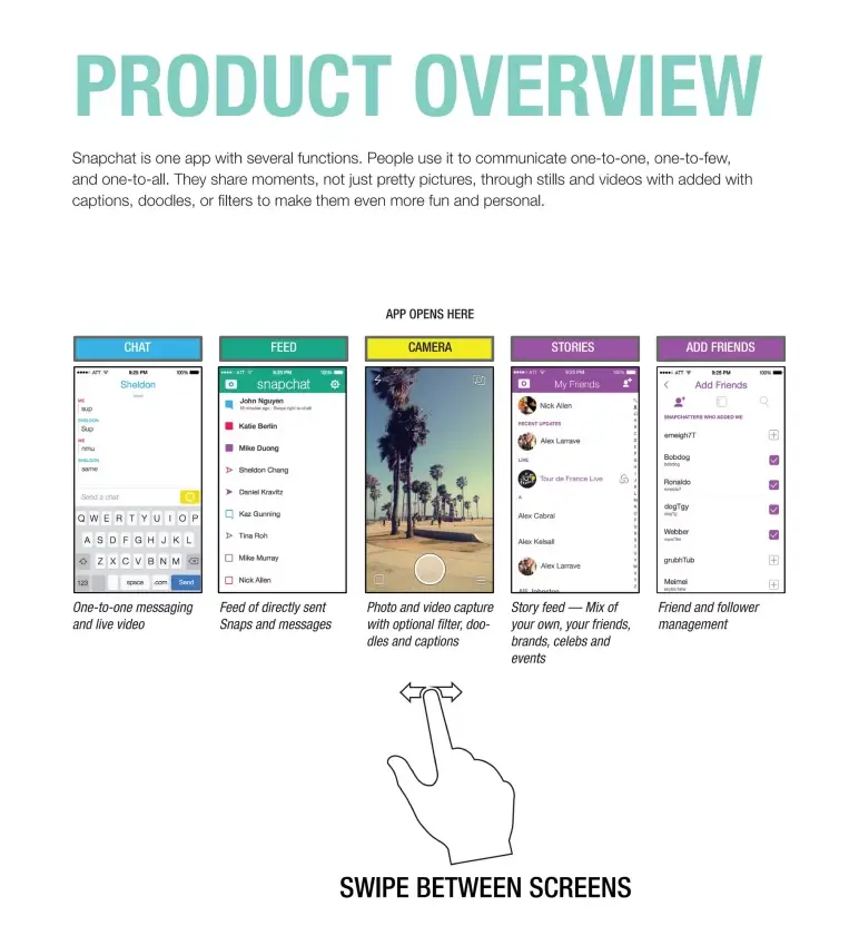
This slide offers a clean visual tour of the app’s main screens—Chat, Camera, Stories, and more. The swipe graphic and simple captions make it instantly understandable, even without much text.
The short paragraph at the top adds context, but it’s the layout and clear labeling that do the real work, making the app easy to grasp at a glance.
Takeaway: Use visuals to guide the viewer through your product. If screenshots tell the story, let them. A pitch deck isn’t the place to explain everything—it’s where you help people get it instantly.
Slide 5: Snap (Feature 1)
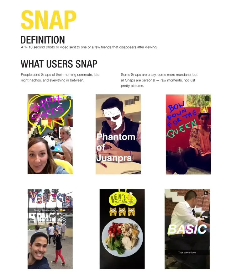
One of the first things I noticed in this slide? It doesn’t try to explain the product with words—it shows it through real snaps.
From doodled selfies to pics of food, commutes, or just random moments, the slide instantly tells you what Snapchat is really about: Everyday life, unfiltered and in the moment.
The heading, “What Users Snap,” sums it up nicely. These aren’t curated, perfect photos—they’re raw, real, and often a little weird in the best way. And that’s the point.
Yes, there’s a short paragraph describing what a Snap is—a 1–10 second photo or video that disappears—but honestly, the images do most of the storytelling.
Takeaway: If your product depends on how people use it, don’t just talk about behavior—show it.
Slide 6: Story (Feature 2)
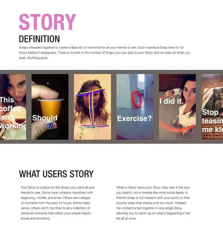
This slide introduces Stories with a simple, user-first explanation: Snaps that play in sequence and disappear after 24 hours. No backend diagrams. No feature bloat. Just the value up front. And that’s what makes it pitch-perfect.
The visuals do the rest. Real examples of Stories in action make the feature instantly understandable, even to someone who’s never used the app.
Takeaway: If your feature needs explanation, don’t overdo it. Keep it clean, keep it visual, and show the benefit like you’re talking to a user, not a developer. If you can’t explain it in one line, it’s not pitch-ready.
Slide 7: Chat here (Features 3 & 4)
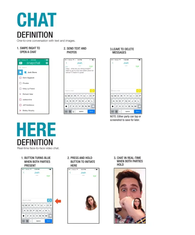
This slide shifts the narrative toward depth, showing that Snapchat is more than just disappearing photos. With a clean split between Chat and Here, the layout walks us through its private messaging and live video capabilities.
I like how the visuals do most of the explaining. Small screenshots map the user journey, making it easy to follow. And by sticking to the brand’s “messages disappear” philosophy, it reinforces consistency across features.
Takeaway: Use slides like this to show product depth—but keep the focus on relevance, not instructions. Make sure every feature you highlight connects back to your core pitch.
Slide 8: Our story (Feature 5)
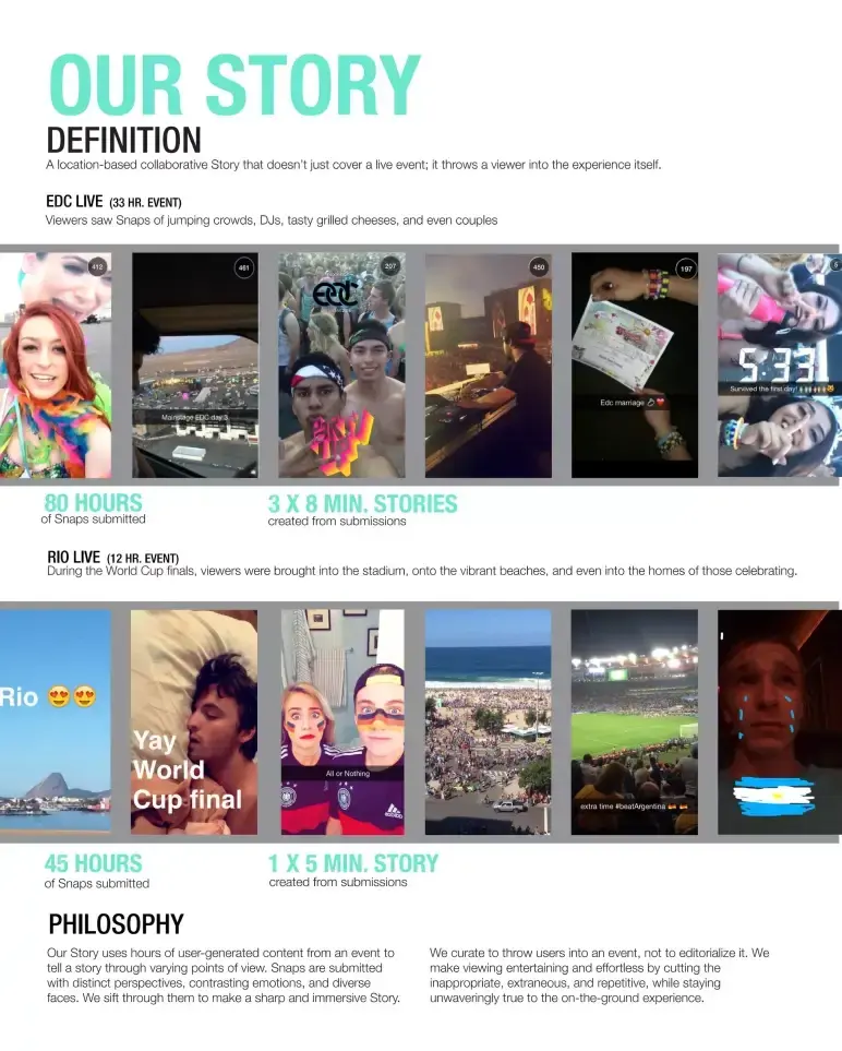
This slide does exactly what a strong mid-deck pivot should: It introduces a bold new feature—Our Story—with clarity and confidence.
The blend of live event examples (EDC, World Cup) and real usage data stands out the most. These aren’t fluff metrics—they show traction and prove the feature can scale. It’s a clever way to say, “We’re not just a messaging app—we’re becoming a media platform.”
The one miss? The slide leans a bit text-heavy. A tighter narrative would’ve kept the momentum sharper.
Takeaway: When introducing a major feature or shift, use real-world examples to ground it, but keep copy tight so you don’t lose energy mid-pitch.
Slide 9: How it works
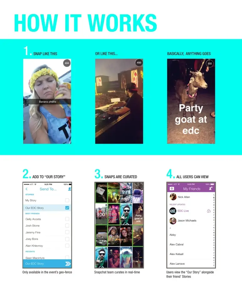
Right after setting up the big idea, this slide brings clarity to execution.
Using a simple step-by-step layout, Snapchat shows how Our Story actually works—from snapping content to it appearing in the live feed. It’s essentially a product flow, broken down visually with minimal text.
That works well for a business audience, especially if you’re pitching a process that could seem abstract.
Takeaway: If your product has a behind-the-scenes engine, map it out clearly. A well-structured flow builds credibility and keeps your audience from guessing how the magic happens.
Slide 10: Now it’s your turn (Business account)
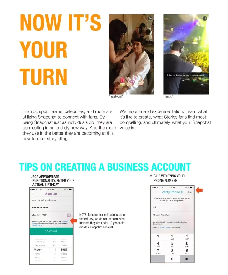
This is the moment where everything comes full circle. The deck opened with a vision—what Snapchat is, who it’s for, and why it matters.
It then walked us through the product, user behavior, growth, and real-world adoption. Now, this slide flips the pitch from presentation to participation.
It speaks directly to brands, creators, and public figures with a clear message: Others are already building real-time, personal connections on Snapchat—now it’s your move. It’s not a hard sell. It’s a confident handoff.
The line “We’re on a mission. Want to help shape it?” ties it all together. After walking the audience through what makes Snapchat different, this final nudge invites them to join that mission.
Takeaway: End your deck by connecting your story back to the audience. A clear call-to-action isn’t just a closer—it’s how you make your pitch personal.
Slide 11: What do I snap? (Content tips)
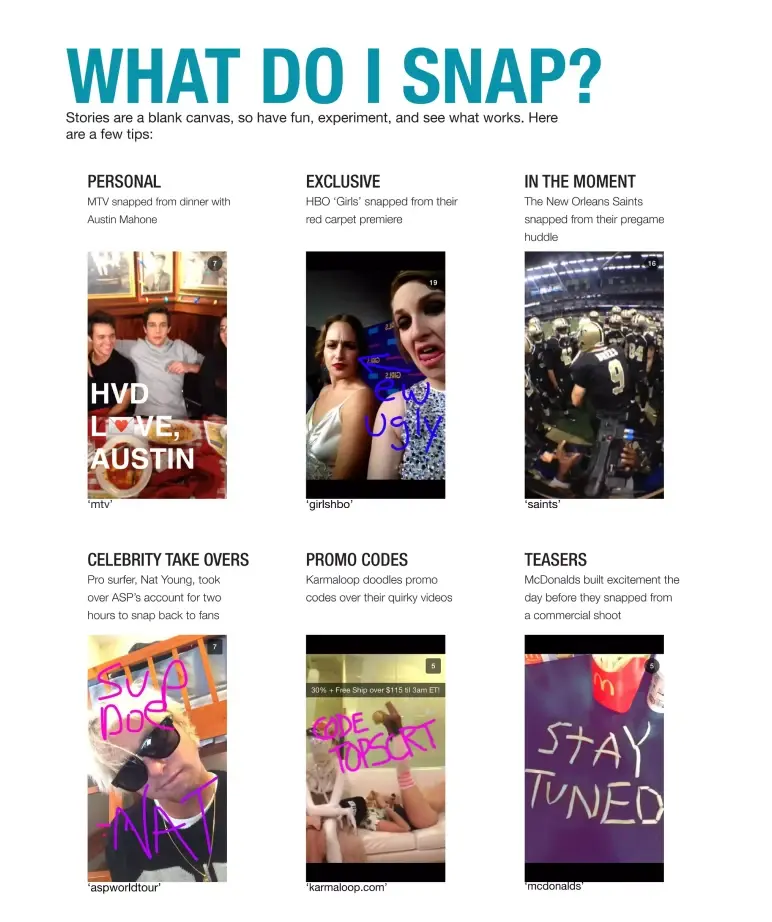
At this point in the deck, Snapchat gets ahead of the most obvious question any brand or business would ask: “Okay, but what do we post here?”
This slide isn’t just a list—it’s a visual playbook. Six real examples from well-known brands show exactly how different types of content work on Snapchat.
Design-wise, it’s smartly structured. The handles of each brand are visible, making it easy for anyone to look them up and see the execution live.
What I like about this slide is that it delivers practical guidance without being text-heavy.
Takeaway: If your product or platform requires a behavior shift, then show your audience how others are already succeeding with it. Real examples reduce hesitation and give them a clear path to start.
Slide 12: Get the word out (Promotion)
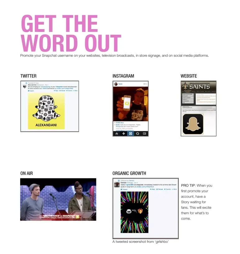
Once brands know what to post, the next question is clear: How do we get followers?
Snapchat answers that with a practical, visual slide showing how real brands—from HBO’s Girls to the New Orleans Saints—promoted their accounts across Twitter, Instagram, websites, and even TV.
It’s not just advice—it’s action. Real examples, smart cross-promotion, and a thoughtful tip to “have a Story live before you promote” all reinforce one message: Build early momentum by showing value first.
Takeaway: If your product relies on adoption or community growth, don’t assume your audience knows how to spread the word. Use your slide space to make it obvious—and irresistible—to start.
Slide 13: Examples (Early Adopters)
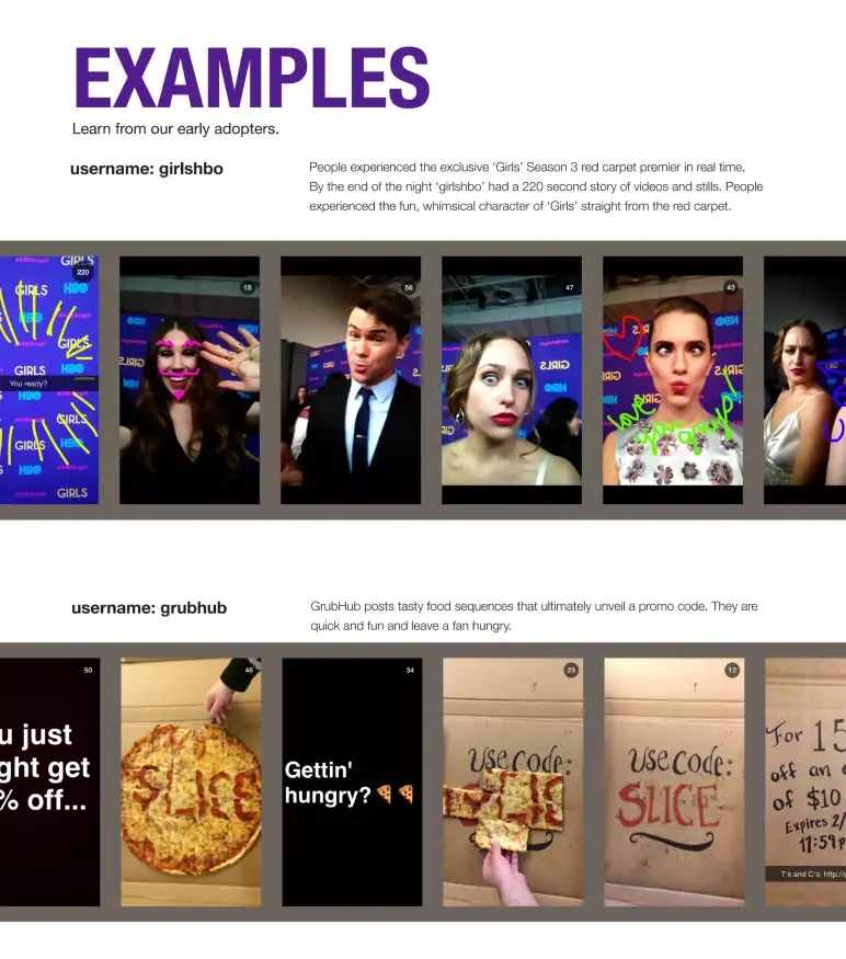
This is the kind of slide that earns trust quickly.
Snapchat features two early brand adopters — HBO’s Girls and Grubhub — not just to name-drop, but to show how real companies were already experimenting with the platform in creative, brand-aligned ways.
From a business pitch perspective, this slide does two important things. It:
- Shows the platform is already in use by recognizable brands.
- Signals that Snapchat can work for both entertainment and commerce.
Takeaway: Case studies on a pitch slide don’t need to be heavy. Highlight real, relevant examples that align with your core audience. Let the brands do the convincing for you.
Slide 14: How to see your stats/Accounts to check out
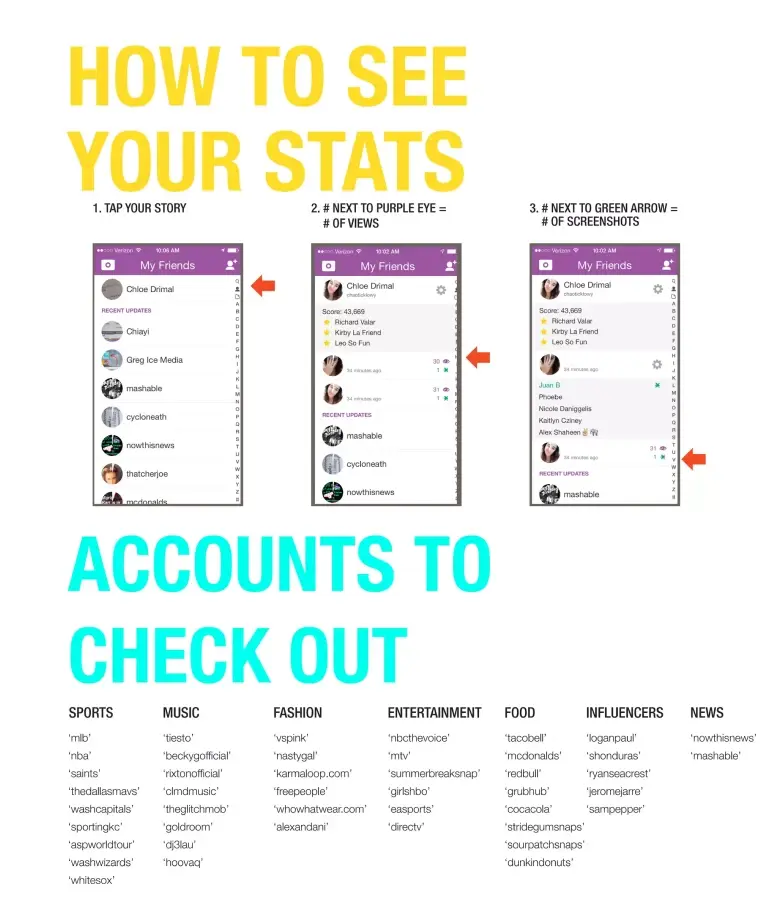
How to See Your Stats + Who to Follow
Snapchat closes the deck with something clever—a soft but strategic nudge.
Instead of a typical “Thank you” or summary, this final slide does two things:
- It educates users on how to measure performance on Snapchat.
- It provides a curated list of top accounts across categories (sports, entertainment, news, etc.) for inspiration.
It doesn’t oversell. It just equips the audience with what they’ll need next.
Takeaway: Not every deck needs a dramatic close. If your audience still needs to see the opportunity for themselves, guide them there. Let your final slide be an invitation to explore, not just a summary of what you’ve already said.
What did I like the most about this deck?
Here’s what stood out to me while going through Snapchat’s pitch deck—not just as a reviewer, but as someone always looking to learn:
- Right from the start, it was clear who this was for—Snapchat spoke directly to partners and advertisers, not investors.
- They didn’t just pitch the potential—they showed it, with real campaigns and brand examples that made the product feel usable.
- Instead of dense explanations, they let the product shine through clean visuals and real content, making everything feel simple.
- Common hurdles were addressed before they became problems—how to sign up, what to post, how to track success.
- They wrapped it up with next steps, not a hard sell—just tools, examples, and a quiet nudge that said, “Your turn.”
If I had to sum it up: This wasn’t just a pitch—it was more like guiding the audience step-by-step. And that’s something a lot of founders can learn from.
Perfect your deck and pitch using Upmetrics
Snapchat’s deck didn’t just pitch a product—it pitched a movement. From redefining communication to inviting brands into a whole new storytelling format, the slides served as a bridge between early users and future partners.
And even though this pitch was crafted years ago, the fundamentals still hold strong today: Clarity, creativity, and knowing your audience.
If you’re working on your pitch deck, there’s a lot you can take from how Snapchat did it—and a lot you don’t have to do alone.
With Upmetrics, you can build investor-ready decks using our AI pitch deck generator or let our team handle the design for you. Plus, if you’re still shaping your idea, our business planning tools help you get clarity from the start.
Time to tell your story—your way.