What do you get when two college dropouts build a payments company so good, developers start recommending it like a secret cheat code? You get Stripe—a startup that quietly processed billions and raised over $2 billion along the way.
But long before it became a fintech giant, Stripe had to pitch investors like everyone else. And the way they did it? Pure clarity.
Their early pitch deck didn’t rely on flashy graphs or jargon. Instead, it leaned into Stripe’s strengths: A developer-first approach, a dead-simple value prop, and a mission so bold it sounded like science fiction.
If you’re building a startup and wondering how to explain your product, your market, or your traction, this deck is worth studying.
In this slide-by-slide breakdown of the Stripe pitch deck, I’ll walk you through what worked, what could’ve been better, and how you can borrow the same playbook for your pitch.
Let’s dive in.
About Stripe (then vs. now)
Back in 2010, two Irish-American brothers—Patrick and John Collison—set out to solve a headache most developers hated: accepting payments online. Their idea was simple but powerful—make it insanely easy for businesses to integrate payments with just a few lines of code. That idea became Stripe.
At the time, they were part of Y Combinator and used this very pitch deck to raise $2 million in seed funding from investors like Peter Thiel and Elon Musk. Their pitch wasn’t about changing the world with buzzwords—it was about solving a clear, technical pain point with elegance.
Fast forward to today, Stripe is a global payment powerhouse valued at $91 billion, powering companies like Amazon, Shopify, and Google.
Why does this matter to you? Because this deck helped them go from “two guys with a dev tool” to one of the most valuable startups in Silicon Valley, by focusing on clarity, timing, and product fit.
Detailed Stripe pitch deck analysis (slide-by-slide)
In this section, I’ll walk you through each slide of Stripe’s original pitch deck—what they did right, where they kept it simple, and what you can learn from it to shape a pitch that gets a yes.
Let’s dive in.
Slide 1: Cover Slide

The very first slide in Stripe’s deck is as clean as it gets—just the company name on a plain background. No subtitle. No clutter. And honestly? That’s what makes it powerful.
I’ve seen a lot of founders overthink the cover slide, stuffing it with taglines, mission statements, or logos of companies they hope to impress. But Stripe does the opposite. It’s calm. Confident. Minimal.
It sets the tone for a clear, focused pitch—and shows polish without trying too hard.
Takeaway: Keep your cover slide minimal and intentional. A clean design with your logo or company name is more than enough. It signals confidence and gives your pitch room to breathe from the very first moment.
Slide 2: Value proposition
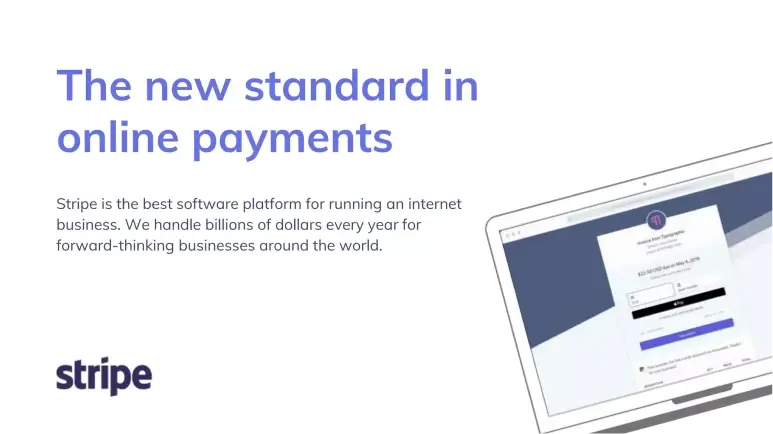
Stripe wastes no time getting to the point. The headline reads:
“The new standard in online payments.”
Followed by a clear one-liner that sums up what they do and why it matters.
From a deck-building perspective, this slide is a textbook example of how to lead with clarity and confidence. In just two lines, Stripe establishes what it offers, who it serves, and why it stands out—all without over-explaining.
It’s also smart copywriting. Words like “new standard” and “billions of dollars” suggest leadership and traction, even without exact metrics. It feels bold but believable.
Takeaway: Start your deck with a sharp, one-line value proposition. Pair it with a single sentence that adds credibility, whether it’s revenue, user count, or market validation. This is your elevator pitch on a slide—make it count.
Slide 3: Product philosophy
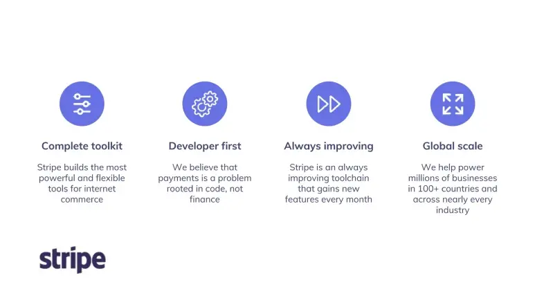
This slide lays out Stripe’s product mindset through four clear pillars:
Developer First.
Always Improving.
Complete Toolkit.
Global Scale.
From a deck design perspective, this is smart positioning. Rather than listing features, Stripe shares how they think—something investors care deeply about. Each pillar addresses a key angle: Who they serve, how fast they build, how complete the solution is, and how far they can reach.
One line stands out, mentioned in “Developer first” point:
“Payments is a problem rooted in code, not finance.”
That reframes the entire industry—and instantly positions Stripe as a tech-native disruptor.
Despite covering multiple points, the slide remains digestible. No blocks of text, just sharp, benefit-driven statements that tell a story.
From my perspective, a few simple icons or visual dividers would help structure the content better. Also, adding even one concrete stat—like “X features shipped per month”—could back the “always improving” claim with proof.
Takeaway: Use a slide to communicate your product philosophy or company DNA. Keep it structured, don’t overload with text, and ensure each point speaks to why you’ll win. Stripe does this exceptionally well.
Slide 4: Social proof
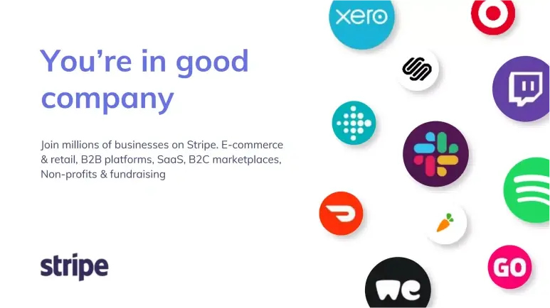
This slide is Stripe’s way of saying, “You’re not the first to trust us.”
The headline—“You’re in good company”—sets a warm, credible tone, followed by a list of sectors using Stripe: e-commerce, SaaS, B2B platforms, non-profits, and more.
From a deck perspective, this is a classic credibility play—and it works. Even without listing logos, Stripe signals wide adoption and strong product-market fit across industries.
The phrasing “millions of businesses” adds weight, even if rounded or projected, it gives the impression of momentum.
What could be improved is that the slide would’ve been even stronger with recognizable logos or early flagship users. Visual proof often lands faster than words.
Takeaway: Use social proof to validate demand. If you don’t have famous logos yet, show user diversity or adoption trends. The goal is to make investors think, “Others are in—should I be too?”
Prepare Your Pitch Deck in Less than an Hour with Our
AI Pitch Deck Generator
Plans starting from $14/month

Slide 5: Market insights
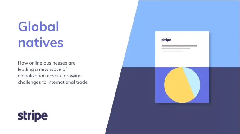
The market insight slide is where Stripe zooms out and frames the bigger picture.
The title—“Global natives”—is clever positioning. It refers to a new wave of businesses that operate globally from day one, even as international trade faces more friction.
What this slide really communicates is: “We’re not just solving a payments problem—we’re enabling a global shift.”
However, even though the concept is strong, the slide lacks supporting data. Even a single stat or a short example—like how many startups now launch globally—would ground the insight. Visually, a global map or trend graphic could also elevate the message.
Takeaway: If your startup rides a larger market shift, highlight it early. Show investors you’re not just solving a problem—you’re building for where the world is going. But remember: Always tie the trend back to your product’s relevance.
Slide 6: Mission
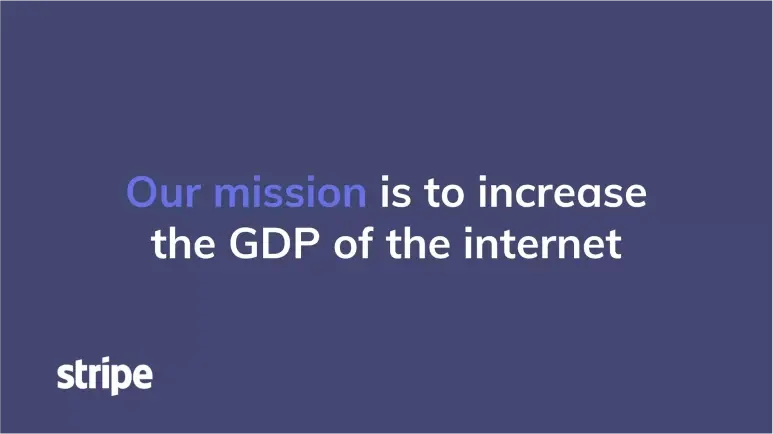
I’ve seen a lot of mission statements buried at the end of decks or written in forgettable corporate speak. Stripe does the opposite. They give their mission its spotlight—and it sticks.
From a slide design perspective, this is a smart play. There’s no clutter, no explanation—just a clean, centered statement on a blank background. That restraint draws attention to the message and forces the reader to pause and think.
And what a message it is. Ambitious. Memorable. Big-picture. You instantly understand that Stripe isn’t building a tool—it’s shaping an economy. That kind of vision gets investors leaning in.
Takeaway: Don’t hide your mission. If it’s bold, give it space to breathe. Use one full slide, keep it clean, and let the words do the work.
Slide 7: Product suite
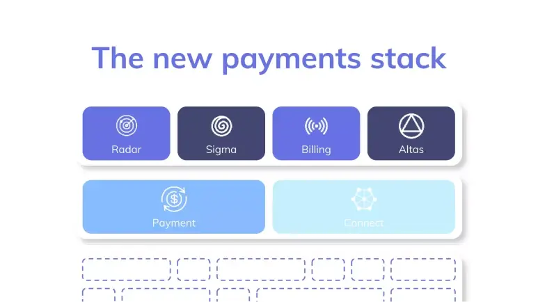
From here, Stripe starts to shift the perception from product to platform.
The slide is titled “The new payments stack,” and it lists tools like Radar, Sigma, Billing, Atlas, Payments, and Connect.
From a slide design standpoint, this is a bold but effective move. Rather than diving into technical features, they just show the product names—lean, clean, and intentionally high-level. It’s the kind of slide that prompts a conversation rather than trying to explain everything at once.
I like what this slide communicates: Stripe isn’t a single API—it’s a full ecosystem. This helps investors see expansion potential—more products mean more revenue streams and stronger customer lock-in.
That said, one thing I found missing was the use of small icons or quick labels under each product (like “Radar – stops fraud”). This would’ve made it easier to grasp what each tool does, especially for people who aren’t familiar with financial tech.
Takeaway: If you’re building more than one product, show the bigger picture. Presenting a full suite (even if early-stage) tells investors you’re thinking long-term. Just ensure it still connects clearly to your core story.
Slide 8: Developer platform
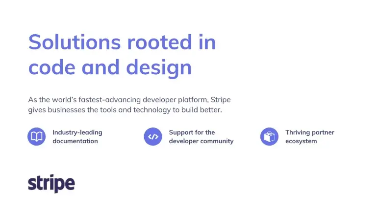
This slide highlights one of Stripe’s biggest strengths—its deep connection with developers.
By calling out things like great documentation, community support, and a thriving partner ecosystem, Stripe makes one thing clear: It’s not just a payments tool—it’s the kind of platform developers rely on to build and scale serious businesses.
It’s a platform developers trust.
Why does this matter in a pitch? Because developers love creating distribution. It lowers adoption barriers, drives organic growth, and builds long-term stickiness. Stripe makes it clear that its growth engine isn’t just sales—it’s product-led and community-powered.
Takeaway: If your users are a key part of your growth loop, make that visible. A slide like this shows investors you’re not just solving a problem—you’re becoming part of how people build.
Slide 9: Problem solved
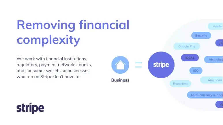
This slide spells out one of Stripe’s biggest value props: You don’t need to deal with banks, regulators, or payment networks—Stripe does it for you.
The visual likely shows a list of logos and partners that are Visa, Apple Pay, Google Pay, and local wallets, underscoring the scale of Stripe’s integrations.
This matters to investors because it highlights both Stripe’s moat and the pain it solves. Managing payment rails, security standards, and compliance across markets isn’t just tedious—it’s a dealbreaker for most businesses. Stripe wraps all of that into one clean platform.
Takeaway: Don’t just say your product is “easy to use”—show what hard stuff you’re taking off the customer’s plate. When your solution replaces chaos with clarity, make that complexity visible—it instantly increases perceived value.
Slide 10: Traction & scale
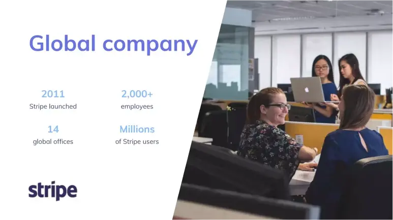
This is Stripe’s traction snapshot slide—clean, stat-heavy, and straight to the point.
Titled “Global company,” it presents four headline numbers: launch year, employee count, number of global offices, and total users. No fluff—just proof of scale.
The slide works because it instantly communicates reach and maturity. It’s structured for quick scanning, likely using large type or icons to make each stat stand out.
Takeaway: Let your numbers speak. A few well-chosen metrics—team size, user base, footprint—can tell a strong growth story on their own. Ensure they’re current, easy to read, and visually well-paced.
Slide 11: Vision/Impact

This slide is unexpected—and that’s exactly why it stands out.
With a single line—“Anthropogenic climate change is accelerating”—Stripe shifts the conversation beyond fintech. There’s no product, no metric, just a bold statement. It breaks the pattern intentionally.
Visually, it likely serves as a pause—something to spark thought. And from a storytelling angle, it hints at Stripe’s long-term thinking: This isn’t just a payments company, it’s a company that’s conscious of the world it’s growing in.
Takeaway: If your values shape how you build, it’s okay to let them show. Just make sure the slide earns its place—use it to add depth to your story, not distract from it.
Slide 12: Partner ecosystem
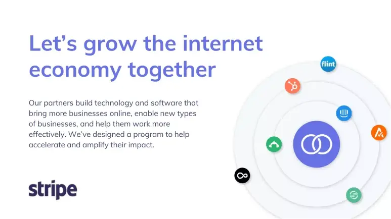
Instead of going it alone, Stripe shows it’s building something bigger, with partners by its side.
The slide introduces its partner program with a collaborative tone, inviting others to help bring more businesses online. It’s a subtle but smart way of showing investors that Stripe isn’t just acquiring users directly—it’s enabling a whole ecosystem to grow around it.
The design likely keeps things simple: a bold headline, a short blurb, and maybe some visuals that suggest scale without being loud.
Takeaway: If partners play a role in your growth, call it out. Investors want to know that your product doesn’t just work in isolation—it multiplies value when others build on top of it. Make it clear how your ecosystem helps you scale faster, together.
Slide 13: Thought leadership
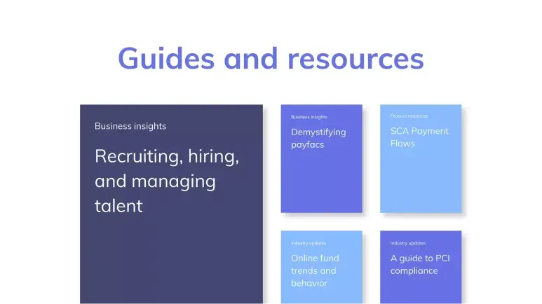
Stripe isn’t just building tools—it’s teaching the internet economy how to thrive.
This slide showcases Stripe’s content engine: business guides, compliance resources, hiring insights, and industry updates. It’s not just noise—it’s strategic. Stripe positions itself as a trusted advisor, not just a service provider.
Rather than adding fluff, this slide reinforces brand authority. It shows Stripe understands its audience’s real struggles—technical and operational—and creates resources to support them at every step.
Takeaway: If content or education plays a role in your growth, don’t shy away from highlighting it. But keep it focused.
Slide 14: Team

Stripe keeps it tight and effective here: four faces, four titles. Patrick and John Collison (Co-founders), Claire Hughes Johnson (COO, ex-Google), and Billy Alvarado (CBO). That’s it.
The simplicity is the strength. Instead of crowding the slide with bios, Stripe lets the names speak. And they do—Claire’s Google background and Billy’s business chops add depth beyond the founders. Investors immediately see a balance of vision, operations, and strategy.
Why does this slide work? Because of no fluff, no overload—just a high-caliber team presented with clarity and confidence.
Takeaway: Don’t just list titles—think about what your team composition says. Use this slide to signal, “We’ve got the right people to win, and we know how to present that cleanly.”
Side 15: Contact
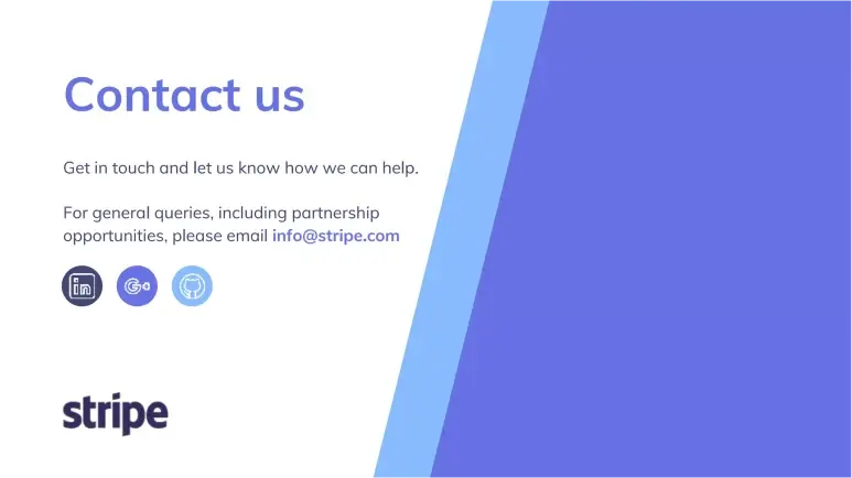
Stripe wraps up with a simple, purposeful closing: an open line of communication. The slide reads something like:
“Contact us – Get in touch and let us know how we can help. For general queries, including partnership opportunities, please email info@stripe.com.”
No noise, no clutter—just a clear invitation to reach out.
Why this slide works: It closes the loop. After showing the product, traction, vision, and team, Stripe ends with a gentle nudge: “Let’s talk.” It’s professional, accessible, and leaves the door open for investors, partners, or anyone curious to follow up.
Takeaway: Always end your deck with clarity. Whether you’re raising funds or sharing your story, give people a next step. Stripe’s final slide says it best: “We’re here if you’re ready.”
Perfect your deck and pitch using Upmetrics
When a pitch deck opens with “Increase the GDP of the internet,” you know it’s not just about product—it’s about vision. Stripe’s deck is a masterclass in storytelling: It ties a technical product to a massive global shift, shows traction without drowning in numbers, and builds trust through clarity and ambition.
Whether you’re a developer-first startup or tackling a different problem, there’s a lot to learn here, like how to frame your startup as the enabler of a bigger movement.
And if you’re working on your own pitch deck or business plan, we know that translating all your ideas into a sharp, investor-ready story isn’t easy. That’s where Upmetrics comes in.
From crafting clean, compelling slides to building a rock-solid business plan, we help founders bring their vision to life, just like Stripe did. Ready to write your own breakout story?
Let’s build it together.